A graphic design that recalls the values of the Festival de la Cité
A colourful choice that suggests both a beautiful summer night and the lights of a stage: those moments that are conducive to the emotions and pulsations of the spectators.
For its 51st edition, the Festival is undergoing a transformation of its visual identity by approaching the Alice Franchetti Studio. Graduates of the ECAL, the members of Studio Franchetti work in the cultural field and are particularly interested in the use of digital tools in the field of architecture.
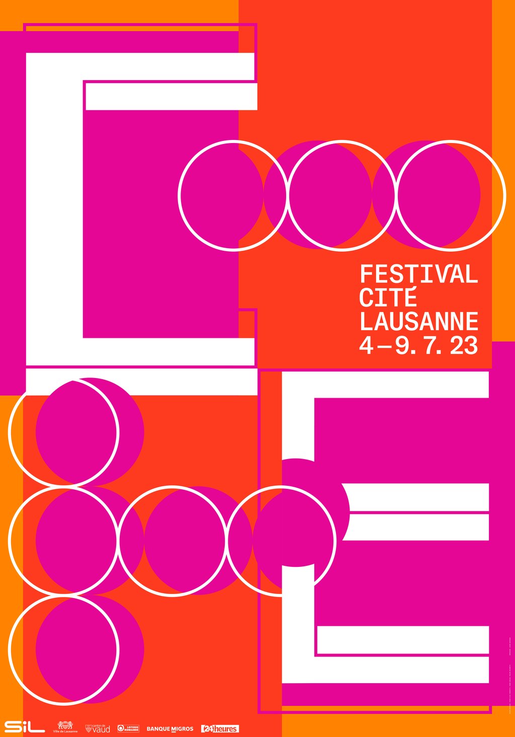
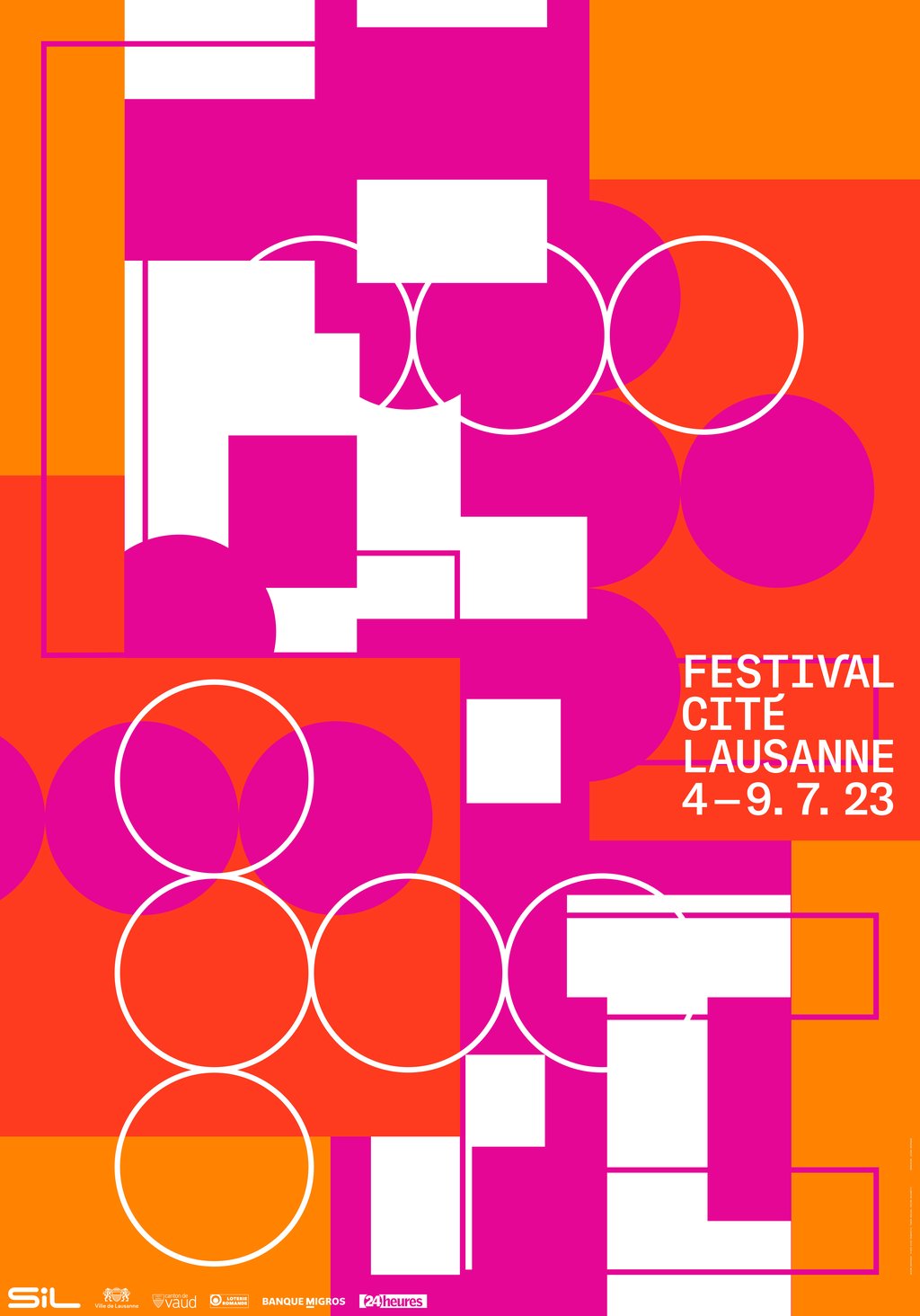
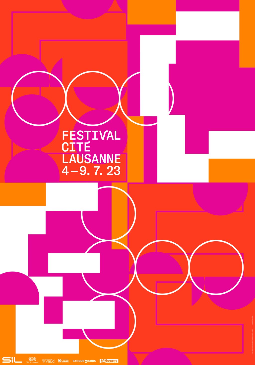
The poster for this year's event takes the letters of the word "Cité" as its starting point, and the graphic designers arrange them in a more or less abstract manner using shapes that recall the topography of the historic district. This arrangement creates a movement that is reminiscent of the flow of the many people who are curious to (re)discover the festival's conviviality and programme. The colours red, pink and orange refine this arrangement. A colourful choice that suggests both a beautiful summer night and the lights of a stage: those moments that are conducive to the emotions and pulsations of spectators.